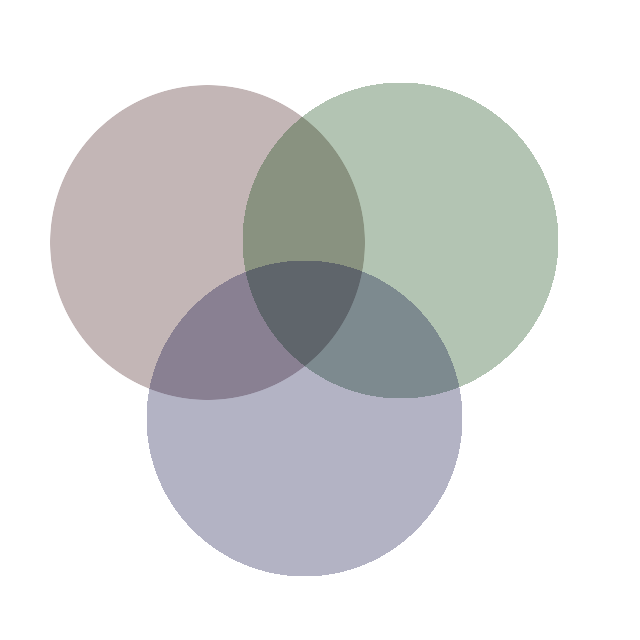
The DS VD: now in d3.js!

As if you could not imagine seeing the Data Science Venn Diagram  any more, it now lives as a standalone interactive data visualization (if you click the link you'll find a version that includes context for each component).

Actually, I needed to practice using the transform function in Javascript and d3.js, and getting those components to tilt the right way was just the ticket. This does, however, present the opportunity for those that wish to embed the diagram to do so.

<iframe src="https://s3.amazonaws.com/aws.drewconway.com/viz/venn_diagram/data_science.html" width="800px" height="720px" frameborder="0" scrolling="no"></iframe><p>Hello, World!</p>

The Data Science Venn Diagram is Creative Commons licensed as Attribution-NonCommercial

Revisiting "Ranking the popularity of programming languages": creating tiers

In a post on dataists almost two years ago, John Myles White and I posed the question: "How would you rank the popularity of a programming language?".

From the original post:

One way to do so is to count the number of projects using each language, and rank those with the most projects as being the most popular. Another might be to measure the size of a language’s “community,” and use that as a proxy for its popularity. Each has their advantages and disadvantages. Counting the number of projects is perhaps the “purest” measure of a language’s popularity, but it may overweight languages based on their legacy or use in production systems. Likewise, measuring community size can provide insight into the breadth of applications for a language, but it can be difficult to distinguish among language with a vocal minority versus those that are actually have large communities.

So, we spent an evening at Princeton hacking around on Github and StackOverflow to get data on the number of projects and questions tagged, per programming language, respectively. The result was a scatter plot showing the linear relationship between these two measures. As with any post comparing programming languages, it was great bait for the Internet masses to poke holes in, and since then Stephen O'Grady at Redmonk has been re-running the analysis to show changes in the relative position of languages over time.

Today I am giving a talk at Monktoberfest on the importance of pursuing good questions in data science. As an example, I wanted to revisits the problem of ranking programming languages. For a long time I have been unsatisfied with the outcome of the original post, because the chart does not really address the original question about ranking.

Scatter plots are a really poor way of displaying rank correlation. In reality, the chart from the original post is a great first step in the exploration of the data. Clearly there is a relationship between the two metrics that is strongly linear; we can see there are many outliers on either side, but, it doesn't help us understand how to rank the languages based on these measures. So, I decided to pull the data again, and create a new visualization.

If you have not seen one before, this is a Tufte-style "slopegraph," which Tufte developed to show the change in gradients over time. Here I am using the technique to compare two independent rankings of the same list. A couple of things to note about the graph:

  • The languages that have been bumped out into the margins by brackets represent ties in the ranking. This happens much more often in StackOverflow data because we must convert the highly skewed number of tags to a rank. Unlike the Github data, where the rank is the value provided.
  • The colors of the lines correspond to a simple k-means clustering of the languages' ranks using five clusters. For the k-means, the distance is based on the among languages in the original scatter plot.
  • The descending grey bands represent the rank quartiles, e.g., the top band is the 100th percentiles, then 80th percentile, etc.

Not, perfect, but I can get much more information on the ranking by looking at this chart

  1. By adding the k-means clusters and the percentile bands, we can see a much clearer picture of how languages group by tiers.
  2. There is actually a large amount of agreement between the two rankings when we view the quartiles as popularity tiers. For example, the purple cluster is almost exclusively in the 100th percentile, or top tier. Save for R, which Github ranks in the 80th percentile! Likewise, the teal cluster is primarily in the next grey band, or second tier
  3. There is also a clear bottom tier for the least popular languages, represented here by the orange cluster.
  4. For some languages this method of ranking is completely useless. In this case, those languages are in the fuchsia cluster. Many of them are very highly ranked in Github, but have zero questions tagged on StackOverflow.

To further simplify the chart, and again to get closer to answering the question of what makes a programming language popular, I redrew the chart given the observations mentioned above:

You'll notice that for the languages in the green cluster I simply pull them out of the vertical ordering and call them "High Variance." Unlike the fuchsia cluster, the rank comparison between Github and StackOverflow is meaningful, but much weaker. These languages fall anywhere between the 20th and 100th percentiles, but from the slope chart we can see that that for many of them the two data sets do not rank them wildly differently.

Given the data, and the observation made in the slopegraph, we can make qualified statements about programming language popularity; such as, "The most popular programming languages are those that fall in the 20th percentile of rank between Github projects and StackOverflow tags." Statements about the second most, and least popular languages are equally valid, though — of course — not definitive. Finally, for completeness, here are the group membership of each language for the clusters:

Of course, all of this is merely an exercise in descriptive analysis. The real value would be in understanding why languages fall into these tiers. Hopefully the folks at Monktoberfest can help me with that one!

Oh, and here are the slides from my presentation at Monktoberfest.

Update: Below is the video of of my talk, graciously provided by the good people at Redmonk.

Questions first, then data - perspectives on data science from a social scientist. Drew Conway Drew Conway's talk at Monktoberfest 2012.

Enter DataGotham

data002_no_back.png

The New York City data community is a very jovial and tight-knit community. We go to Meetups together, visit each other at work to talk about projects, and even occasionally take over bars together. This is partly because all of us are crammed on this tiny island with everyone else; but it's mostly due to the effort of a group of extraordinary people from very different backgrounds committed to making NYC a great place to be doing data science.

One of the threads that has consistently come out of conversations I have had with members of the community is the desire to highlight the strength of NYC's data community vis a vis this diversity of backgrounds and interests. For example, while NYC has become a strong geographic complement to Silicon Valley as a hub for technology startups, the data community stretches far beyond the startups.

Many of our traditional stalwart industries; such as finance, entertainment, and media, that have been building sophisticated analytics products and teams for some time, but have only recently started speaking more publicly about these efforts. At the same time, industries with less obvious connections to the data community; such as design, fashion, and non-profits, have thrust themselves into the NYC data community.

All this is to say, we believe that there is something special about New York that makes it a great place to be doing data science. We think and do things differently, and we have a very diverse and unique set of constituencies in the city that have cultivated a special community and culture. So, we want to show everyone just how awesome this community is.

Enter DataGotham: http://datagotham.com

This event is the first of its kind. Rather than focus on the tools and techniques people are using, DataGotham will bring together professionals from across the NYC data community for intense discussion, networking, and sharing of wisdom. The goal is to tell stories about what problems people are solving, and the highs and lows of that process. DataGotham is being organized by Hilary Mason, Mike Dewar, John Myles White, and myself; and will take place September 13th-14th at NYU Stern.

You can check out our great, and ever expanding, speaker list here: http://www.datagotham.com/speakers/. We also have four tutorials running on the afternoon of the 13th, followed by cocktails and The Great Data Extravaganza Show at the Tribeca Rooftop that evening.

Tickets are on sale now, and can be purchased at http://datagotham.eventbrite.com. Also, as a reader of this blog, I would like to offer you a special discount of 25% off registration by using the promo code "dataGothamist" when you register.

We are very excited about the opportunity to provide a platform for this great community, and we would love to see you there!
The Shades of TIME Project

03_10_1938_0.jpg

A couple of days ago someone posted a link to a data set of all TIME Magazine covers, from March, 1923 to March, 2012. Of course, I downloaded it and began thumbing through the images. As is often the case when presented with a new data set I was left wondering, "What can I ask of the data?"

After thinking it over, and with the help of Trey Causey, I came up with, "Have the faces of those on the cover become more diverse over time?" To address this questions I chose to answer something more specific: Has the color values of skin tones in faces on the covers changed over time?

I developed a data visualization tool, I'm calling the Shades of TIME, to explore the answer to that question.

The process for generating the Shades of TIME required the following steps:

  1. Using OpenCV to detect and extract the faces appearing in the magazine covers
  2. Using the Python Image Library to implement the Peer, at al. (2003) skin tone classifier to find the dominant skin tone in each face
  3. Designing a data visualization and exploration tool using d3.js

The code and data are all available at my Github. Instructions for how to use the tool to explore the data are available at the tool page itself. It is worth checking out just as a fun way to explore the TIME Magazine covers.

I have two primary observations from exploring the data. First, it does appear that the variance in skin tones have changed over time, and in fact the tones are getting darker. Most of the first quarter of the data are hard to interpret because TIME was still largely using black and white images, and when they did use color it was often artist's renderings of portraits. The interpretation of skin tone in drawings is difficult. Around the mid-1970's, however, there appears to be an explosion of skin tone diversity. Of course, there can be many reasons for this, not the least of which may be improvement in photo and magazine printing technologies.

Second, and much more certainly, is TIME has steadily increased the number of faces that appear on their covers over time. As you scroll through the visualization you will quickly notice the number of faces per cover increase from one, to a few, to many in the 1990's through 2010's. Whether this is the result of a desire to show a more diverse set of faces, or increase their marketing appeal on newsstands, or both; is completely unknown.

But, as with most data projects of this nature the resulting tool generates more observations than questions. Perhaps the most important is how brittle the out-of-the-box face detection algorithms were. As you click through the tone cells you will notice that many of them do not correspond to a face at all. As such, it may be difficult to interpret any of this as relevant to the motivational question. That said, in aggregate there are many more faces than there are false-positives, so the exercise still seems useful.

Code for Machine Learning for Hackers

With the release of the eBook version of Machine Learning for Hackers this week, many people have been asking for the code. With good reason—as it turns out—because O'Reilly still (at the time of this writing) has not updated the book page to include a link to the code.

For those interested, my co-author John Myles White is hosting the code at his Github, which can be accessed at:

https://github.com/johnmyleswhite/ML_for_Hackers

Please feel free to clone, fork, and hack the repository as much as you like. As we mention in the README, some of the code will not appear exactly as it does in the text. This happens for two reasons; first, because some minor formatting changes had to be made to fit the code into the book; and second, some of the code has been updated or edited to remove typos and minor errors.

We hope you find the code a useful supplement to the text!