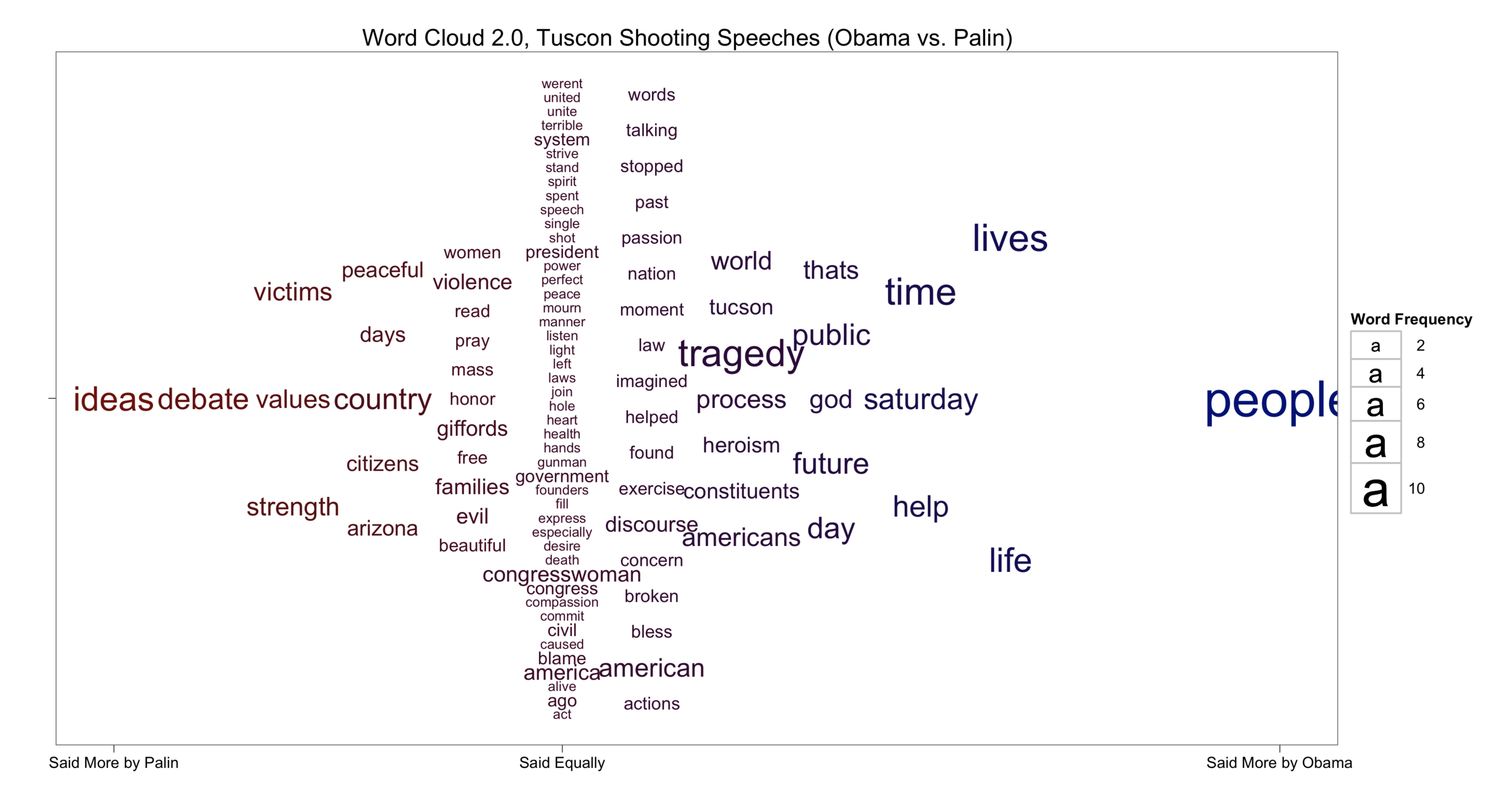
The best data visualizations should stand on their own, which is why I present the word cloud before explaining how I created it. What do you think?
To understand how these speeches compared I first needed to create a term-frequency matrix, which contained only words used in both speeches. After removing common English stop words and the word 'applause' (Obama's speech was in front of a live audience), and retaining only words contained in both speeches at least once, I was left with 103 words to visualize.
To show how the two speeches contrasted, I decided to use the x-axis position to pull words used more by one politician closer to either the left or right of the plot. Words used more by Palin are to the left, and likewise words to the right were used more by Obama. The color reinforces this information, making words Palin words darker red, and Obama darker blue. The scaling of the x-axis is also very important. Note that the "Said Equally" partition does not appear at the exact center of the graph—this is intentional. The word "people" is said more by Obama than any shared word in the corpus. The variance in distance between the equal partition and the edges of the plot is meant to convey this disparity.
Next, I wanted to improve the word cloud, but not redefine it. The base motivation of a word cloud is to convey term frequency by the word size, therefore, this remains true here. In this case, however, because there are two different frequency counts for each text some reduction in data must be used to fit the data into a single visualization. To accomplish this, those words used more often by either politician are sized based on the frequency of the word in that politician's speech. For example, both Obama and Palin use the word "violence," but Palin uses it more; therefore, that word is sized by its frequency in her speech. Logically, words at in the equal partition are sized by their frequency in both speeches.
For the y-axis I wanted to maximize readability. One of the most frustrating things about traditional word clouds is how hard they make you work to read the words. As such, I created a simple function that equally spaced the words on the y-axis given the number appearing in each vertical partition. It isn't perfect, but for this relatively small number of words all are reasonably visible. Also, the ordering from top to bottom is simply the descending alphabetical order of each vertical partition.
While this is a very simple extension of the traditional word cloud, much more can be learned from it. For example, both politicians used the words "congresswomen," and "america" equally but also frequently. While the word "tragedy" is used often in both speeches, but slightly more by Obama. The edges are most interesting. Palin repeated the shared terms "ideas," "debate," "victims," "values," and "strength," while Obama focused on "people," "lives," and "life."
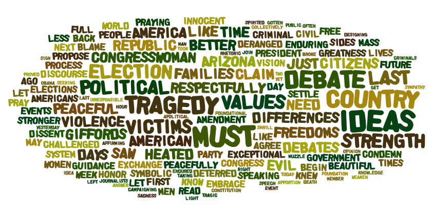
A clear weakness in this approach is that words that are not in the intersection of two texts are ignored. In an effort for full democratization of methods for visualizing word frequency, below are the Wordle versions of the texts used to create the above visualization. They are presented side-by-side to allow for comparison.