Thoughts on Measuring Social Influence

Over the past few weeks I have had several conversations with people interested in understanding how to understand the dynamics of influence in online discourse. Clearly, there is a social network aspect to this, as in these platforms provide the medium for these exchanges to take place and in most cases users are only subject to information existing on their network (the notable exception being Twitter, though most users still only pull information from those they are following). The primary question is: how does online social activity manifest itself in offline behavior? For example, to what extent to do social networking platforms influence voting behavior; or, how do reviews of recently released movies posted to Twitter affect an individual's likelihood to see it in the theater; or, are online discourses a meaningful path to violent radicalization?

From an analytical perspective, the difficulty is that there are no reliable ways of measuring the process by which this influence occurs. Intuitively, we know that influence is happening online, but this process is largely hidden within the context of online exchanges. As we often represent online social interactions as networks, and because much of the relevant data will have a network form, it may be useful to begin by framing this problem in terms of a graph.

In these terms, there are at least two ways one might approach this problem. First, to measure influence we might attempt to identify influential individuals, and subsequently measure their activity. An important assumption here is that people are influenced in some relatively uniform way as a function of receiving information from those they "trust". Over time, and assuming a constant rate of influence, as individuals self-organize to these influencers we could infer individual level of influence. A second approach is to attempt to measure signals related to the digestion of information. That is, rather than assume influence comes from key actors do the reverse, assume influence comes from pivotal pieces of information. In this case, these signals might come in the form of first-, second-order, etc., transmission of these key bits of information from their source, or the infusion of a some bit of information into a network from multiple sources. As with the influential actors approach, by observing these signals over time could approximate changes in preference and thus infer influence.

In the context of these competing approaches this problem becomes a philosophical one, and exemplifies the fundamental differences in node versus edge analyses in networks. By assuming individuals drive influence we are taking a node-centric approach, wherein actors have some valuation for information received online, and are therefore attracted to those individuals that maximize this utility. The edge-centric approach assumes that content is valued over source, and that the information contained on some edge is the primary engine to influence. It has always been my contention that too much time is spent focused on nodes in network analysis. In fact, the problem of measuring influence in online social networks is an excellent example of the value of edge-centric analysis.

As stated, this is essentially a measurement problem—we need a way to quantify information digestion, but lack an appropriate metric. Consider, a social network with some fixed number of nodes. By focusing on the characteristics of the nodes we are inherently limiting our analytical scope. While the most "central" actors may change over time, we can never achieve a meaningful measure of influence by simply examining the structural characteristics of these nodes. Influence can only occur as a function of edges; therefore, it they must be the primary unit of analysis in this endeavor. Perhaps this is why I have always been a big fan of the line graph transformation.

The value of edges in complex network visualization

Given the convergence of national security and data nerds that come to this blog, I am sure that by now most of you have read the article in yesterday's New York Times on how PowerPoint in the silent killer of military intelligence. The catalyst of this discussion appears to have been this now infamous slide on the Afghan Stability / COIN Dynamics produced by PA Consulting Group.

article-0-09562375000005DC-283_964x699.jpg

For most of you this is old news, as this slide has been circulating the Internet for several months. A such, this post is not about the slide, or the notion that slide decks are detrimental to the intelligence process more generally. Others have said their piece (most of whom having little to know knowledge of the intelligence process); therefore, I will only say that fundamentally intelligence is about distilling extremely complicated things into neat digestible pieces for leadership to evaluate and make decisions. If you think "bullet-point" level detail is bad for intelligence then your problem is with the demand side of the equation—not the supply. But I digress...

In reviewing the reignited interest in this slide I came across an old post by Andrew Gelman wherein he critiques only the visual aspects of the network chart. There was one line that stood out to me:

I understand the goals of showing the connections between the nodes, but as it is, the graph is dominated by the tangle of lines.

Indeed, which moved me to think about the value of drawing edges in complex network in writ large. In my experience, except for the sparsest of network data, edges adds very little information to the visualization. In fact, edges often detract from the analytical value of a network plot by creating a confusing weave of lines that are impossible to follow or understand. I propose that the value of drawing edges is actually an asymptotic function of the density of the network data in question. I even made a picture.

edge_value.png

This is not to say that edge data should not be used in a visualization—in fact —quite the contrary. Edges are needed to calculate the placement of nodes in many of the most information visualization algorithms. For example, techniques such as Fruchterman-Reingold and Kamada-Kawai attempt to minimize the distance between nodes with related structure and prevent nodes from being drawn on top of one another. As such, the placement of nodes in two-dimensional space is meaningful (structurally similar nodes will be closer), but once the positions of the nodes have been calculated the value of the edges is used. Consider the recently generated visualization of the relationships among artists in the last.fm database.

lastfm_800_graph_white.png

The author (Tamas Nepusz, co-creator of igraph) has created something truly stunning, both in terms of aesthetics and information. Each nodes is colored by genre, and using a force-directed layout we can see that there are strong relationships among rock (red), pop (green) and hip-hop (blue). As we look toward the center, however, potentially interests aspects of the visualization are lost within the maelstrom of edges, to the point where it is nearly impossible to recognize what is happening. Now, consider the alternate "cloud" version of this network.

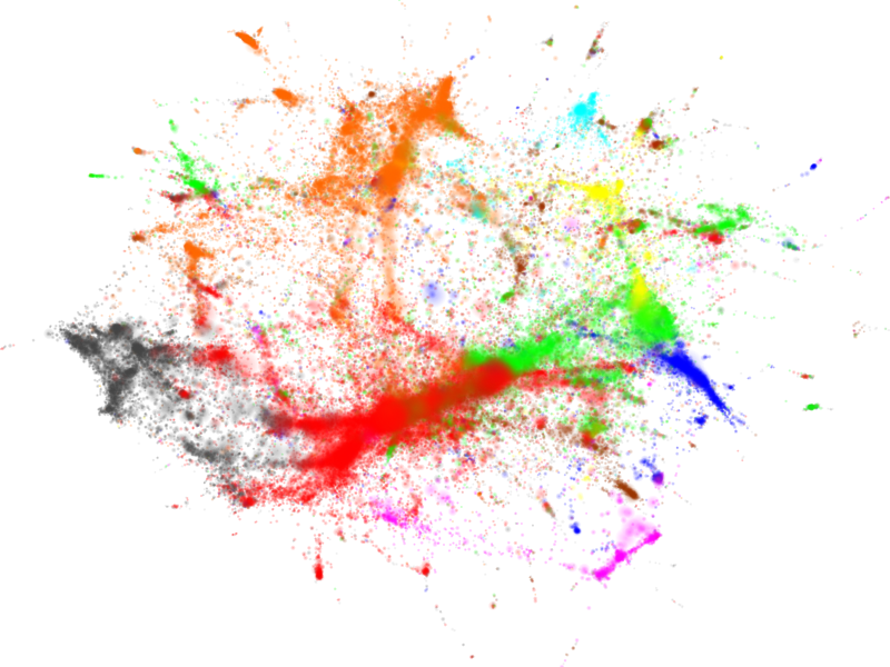
lastfm_800_cloud_white.png

Personally, I do not like the blurring of nodes, and the loss of labels; however, by removing the edges and allowing the nodes to stand alone the relationships among various music genres and artist is much more apparent. For example, it is much easier to see small clusters at the center and periphery. Being able to see these makes an observer want to investigate those clusters further, and see what artists they represent. In addition, edges can present a deceptive illustration of the strength of ties between clusters. Note the magenta (reggae and ska) cluster in the lower-right of the network. With the edges, it appears that this cluster has strong ties to within the network (note the edges pulling it in two directions). Without the edges, however, we can see that this cluster is actually much more peripheral relative to the density of ties among the other genre clusters.

A while back I proposed the idea of using invisible edges to identify clusters of nodes in three-dimensions with the so-called "exploded network view," which is really simply an extension of the idea that edges have steeply diminishing value in network visualization. Going forward I will being drawing edges much more sparingly, and I highly recommend that analysts also consider the value of drawing edges when attempting to present network analysis visually.

Thouhts on First MPSA

I have been absent from the blog this week because I was attending the Midwest Political Science Association (MPSA) annual conference in Chicago. This was my first conference specifically within the discipline, which gave me a chance to see a very broad collection of my colleagues, learn about their work, and observe the idiosyncrasies of my particular field. After two days, nine panels (including my own) and two nights out, I have a few thoughts on the conference specifically and political scientists more generally.

  1. Narratives versus tests – I have spent a lot of time on this, and other blogs, talking about the divide within political science with respect to doing qualitative or quantitative research. One of the most striking themes that I came away from the conference with; however, was that this divide is really a sub-divide within a higher level split within the research community: narratives versus tests. In the former case, a large number of the paper discussions I listened to were interested in creating a rich narrative regarding some narrow substantive field. Whether it be political institutions in Ghana or terrorism is Latin America, many researchers' work sought to provide deep descriptions of these situations, often within the framework of their own personal experiences. On the other hand, the the latter set of researchers set forth to generate hypotheses within their area of research, and then develop a methods—either qualitative, quantitative, or both—for testing these hypotheses. Likewise, these hypotheses frequently came from personal experience, e.g., field research or country of origin. This difference of vision sets up a very interesting divergence of opinion, often resulting in passionate, though respectful, debates within panels.
  2. Political scientists are actually really nice – In this I was very pleasantly surprised. Leading up to the conference several faculty members had filled the collective grad student consciousness with horror stories of fiendish panel discussants and "hand grenade-like" questions being lobbed in from the audience. For me, and after talking with several colleagues, our experience was diametrically opposed. With respect to the discussants, I received outstanding and detailed comments from Andrew Healy of LMU on my research, and in fact all of the discussants I sat in on provided very constructive comments to their panelists. Outside the panels as well, interacting with each other in the hallways and hotels, everyone was very happy to share thoughts on research, a citation, or even an introduction to faculty from their universities. I do not know about other social science disciplines, but the political scientists are a great group to spend time with if you ever lucky enough to get them in such a large group (as one newly wedded couple found out at the conference hotel). Finally, it was great to meet in person many people that I had only interacted with online; particularly, Laura Seay, Eduardo Leoni and Kerim Can.
  3. On technology and data – Apparently, this was the first year MPSA provided LCD projectors for panelists, which meant in previous years over-head projectors were used during presentations. Though relived that the conference decided to leap forward into the early 1990's, this did not mean that everyone was prepared for this revolution. There is a fortune to be made in designing a truly idiot proof projector, perhaps Apple could create a one button projector as an accessory to the iPad? More broadly, however, I was a bit disappointed in the technological sophistication of some researchers interested in hi-tech sub-fields. For example, I heard a talk about analyzing the tweets of politicians as compared to their statements made through more traditional media outlets. An interesting question no doubt, but when asked how the Twitter data had been collected the author responded that she had copy-pasted the tweets by hand. The lack of familiarity with the medium of interest in this particular case was bordering on obscene, but in general it was clear that political scientists have a lot to learn in terms of collecting, storing and analyzing large data. That said, I saw lots of R being used, despite the fancy display booths setup by Stata and SPSS.
  4. The students coming out of U. of Michigan are impressive – Somewhat by chance, I sat in on several panels that included presenters and/or discussants from the University of Michigan, and I was very impressed. Across the board, these grad students had very well structured research, with tight methodological designs, and focused questions. Rather then talk about the students and their papers specifically, I would simply recommend the reader to peruse the listing of the grad students at Michigan, as they are doing some great work.

If you attended the conference, I am interested in your thoughts. Do your impression match mine, or was your experience completely different?