The value of edges in complex network visualization
Given the convergence of national security and data nerds that come to this blog, I am sure that by now most of you have read the article in yesterday's New York Times on how PowerPoint in the silent killer of military intelligence. The catalyst of this discussion appears to have been this now infamous slide on the Afghan Stability / COIN Dynamics produced by PA Consulting Group.

For most of you this is old news, as this slide has been circulating the Internet for several months. A such, this post is not about the slide, or the notion that slide decks are detrimental to the intelligence process more generally. Others have said their piece (most of whom having little to know knowledge of the intelligence process); therefore, I will only say that fundamentally intelligence is about distilling extremely complicated things into neat digestible pieces for leadership to evaluate and make decisions. If you think "bullet-point" level detail is bad for intelligence then your problem is with the demand side of the equation—not the supply. But I digress...
In reviewing the reignited interest in this slide I came across an old post by Andrew Gelman wherein he critiques only the visual aspects of the network chart. There was one line that stood out to me:
I understand the goals of showing the connections between the nodes, but as it is, the graph is dominated by the tangle of lines.
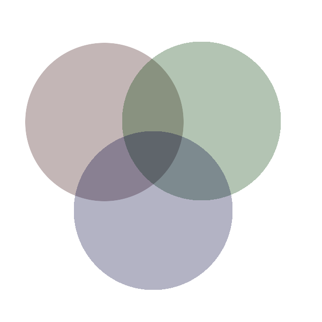
Indeed, which moved me to think about the value of drawing edges in complex network in writ large. In my experience, except for the sparsest of network data, edges adds very little information to the visualization. In fact, edges often detract from the analytical value of a network plot by creating a confusing weave of lines that are impossible to follow or understand. I propose that the value of drawing edges is actually an asymptotic function of the density of the network data in question. I even made a picture.

This is not to say that edge data should not be used in a visualization—in fact —quite the contrary. Edges are needed to calculate the placement of nodes in many of the most information visualization algorithms. For example, techniques such as Fruchterman-Reingold and Kamada-Kawai attempt to minimize the distance between nodes with related structure and prevent nodes from being drawn on top of one another. As such, the placement of nodes in two-dimensional space is meaningful (structurally similar nodes will be closer), but once the positions of the nodes have been calculated the value of the edges is used. Consider the recently generated visualization of the relationships among artists in the last.fm database.

The author (Tamas Nepusz, co-creator of igraph) has created something truly stunning, both in terms of aesthetics and information. Each nodes is colored by genre, and using a force-directed layout we can see that there are strong relationships among rock (red), pop (green) and hip-hop (blue). As we look toward the center, however, potentially interests aspects of the visualization are lost within the maelstrom of edges, to the point where it is nearly impossible to recognize what is happening. Now, consider the alternate "cloud" version of this network.
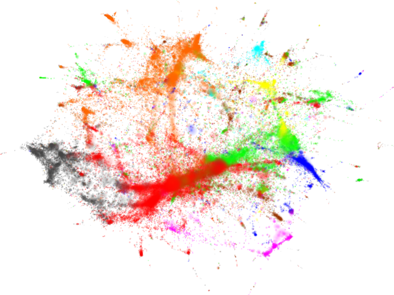
Personally, I do not like the blurring of nodes, and the loss of labels; however, by removing the edges and allowing the nodes to stand alone the relationships among various music genres and artist is much more apparent. For example, it is much easier to see small clusters at the center and periphery. Being able to see these makes an observer want to investigate those clusters further, and see what artists they represent. In addition, edges can present a deceptive illustration of the strength of ties between clusters. Note the magenta (reggae and ska) cluster in the lower-right of the network. With the edges, it appears that this cluster has strong ties to within the network (note the edges pulling it in two directions). Without the edges, however, we can see that this cluster is actually much more peripheral relative to the density of ties among the other genre clusters.
A while back I proposed the idea of using invisible edges to identify clusters of nodes in three-dimensions with the so-called "exploded network view," which is really simply an extension of the idea that edges have steeply diminishing value in network visualization. Going forward I will being drawing edges much more sparingly, and I highly recommend that analysts also consider the value of drawing edges when attempting to present network analysis visually.