The Evolution of Report Summaries in WikiLeaks Data Over Time

Last week I posted a visualization of the reports in the WikiLeaks data projected onto a map of Afghanistan in yearly slices. Much to my delight, many people found this visualization of the data helpful, with special thanks to Wired's Danger Room blog for picking up the post and giving some well-deserved press to the power of open-source tools. While this visualization was powerful in how it conveyed the spread and increase of the military's activity in Afghanistan over time, it did not give a sense of what was actually going on in the reports.

In today's visualization I would like to dig deeper in the WikiLeaks data by analyzing the contents of report summaries, and attempt to visualize the evolution of topics in these summaries over time. To achieve this, it will be necessary to distill the tens of thousands of report summaries into general terms that best represent the topics of those reports. Using a subset of the data for reports from only the NORTH, SOUTH, EAST and WEST regions, i.e., excluding reports labeled as CAPITAL and UNKNOWN, I have performed an analysis on the report summary data using common text-mining techniques. Below is a visualization of the results, followed by a brief explanation of how the images were produced.

First, given the detail in the maps, the image was rendered in high-resolution and is being shared using Microsoft's zoom.it. The image is best viewed in fullscreen more, and I recommend you explore it that way.

First, I have used a technique called Latent Dirichlet allocation (LDA) to generate the terms above. The method is far too nuanced to describe in detail here; but generally, it is used to measure similarity among disparate pieces of data and create partitions of these data that can be thought of as most representative of the overall set. It is most often used in generating topic models from large text corpuses, such as the WikiLeaks report summary data. By ignoring common English stop words, and adding a few specific to this data (click here to view the code for the LDA model), I specified the model to produce ten topics, with five terms in each, for every year/region pair in the data. For every pair, therefore, the model produced 50 terms that "best fit" the topics that pair represents.

To visualize these results, I projected the terms onto their corresponding region in Afghanistan, and sized them by the frequency they appeared in topics for each pair. It is common in LDA models for words to appear in multiple topics, so it was logical to make those that appeared more than once more prominent in the visualization. The terms were then colored by region to make it easier to distinguish among them at the regional borders. As you can see, the results are quite interesting.

The frequency of terms like "IED" and "EOD" increase in the northern region, while "friendly," "forces" and "engage" become very prominent in the south in 2007. I have spent a lot of time exploring the image and found it to be quite fascinating, and I hope you will too. Also, many of the terms appear to be military acronyms that I am unfamiliar with, so I hope one of my more astute readers may be able to decode some of what is being represented by the topic models. UPDATE: With the help of Josh Foust and Greg Hannah, I have started an acronym reference guide below. If you know the meaning of one of the blank acronyms, please let me know!

Finally, if you have an idea for a future analysis I am happy to take suggestions. I, along with a esteemed team of data hacks, will be presenting some of our findings in this data at the next NYC R meetup and we welcome all ideas!

Acronym Guide

41r

MGRS Coordinate

kdz

Kunduz

41s

MGRS Coordinate

kpf

42s

MGRS Coordinate

loc

aaf

Anti-Afghan figters

ltc

Lieutenant Colonel

abp

Afghan Border Police

mes

acm

Anti-coalition militia (disc)

mey

Meymaneh

amf

Afghan Militia Force (disc)

nds

National Directorate of Security (Afghan Intel service)

ana

Afghan National Army

ngo

Non-governmental organization

anp

Afghan National Police

nov

att

At this time

oda

Operational Detachment (Alpha) – special forces

baf

Bagram Air Field

opord

Operational order

bcp

pak

Pakistan

bda

Battle damage assessment

pakmil

Pakistan Military

cas

Close air support

pax

Persons/personnel

cexc

pek

cjsotf

Combined Joint Special Operations Task Force

phq

Police headquarters

cjtf76

Combined Joint Task Force - 76

plt

Platoon

cop

Combat outpost

poo

Point of origin

coy

Company

prt

Provincial reconstruction team

cstc-a

qrf

Quick reaction force

dcg

rcp

Route clearance Patrol

eod

Explosive ordinance disposal

rpg

Rocket propelled grenade

esoc

saf

Special Operatiions Forces

fob

Forward Operating Base

salt

Size, Activity, Location, Time

fra

French

tgt

Tacical Group T

frago

Fragmentary order

tic

Troops in Contact, i.e. combat

idf

Indirect fire

usmc

United Stated Marine Corp

ied

Improvised explosive device

uxo

Unexploded ordinance

inf

Infiltrate

vbied

Vehicle borne-IED

ins

Insurgents

vino

ivo

In vicinity of

w/d

Wheels down

kaf

Kandahar Air Field

w/u

Wheels up

kaia

Kabul international airport

wia

Wounded in action

Wikileaks Attack Data by Year and Type Projected on Afghanistan Regional Map

Below is a visualization of the Wikileaks data produced in collaboration with Michael Dewar. This plot shows attacks in the data set by year and type, projected onto a map of Afghanistan with district boundaries.

events_by_year_map.png

This visualization is certainly not perfect, i.e., some colors are difficult to discern, but it does provide added insight to the level and location of fighting over six years o the war represented by the data.

R code available here.

Graphs, Disease and Mental Health

During my last visit to DC I had the great pleasure of meeting CPT Benjamin Kirkup, a Microbiologist at Walter Reed Army Institute of Research's Department of Wound Infections. CPT Kirkup had invited me to his laboratory to discuss how "big data" could help their mission: combat new and virulent strains of drug resistant infectious diseases. Having not taken a biology class since high school (truly), I was both surprised and honored by the invitation.

As we began to discuss more of the lab's work, CPT Kirkup described the changing strategies and challenges for combatting infection. He noted that while the care received by soldiers has greatly improved over the last several decades; with respect to first-aid, surgery and rehabilitation, there is serious concern about the spread of drug resistant diseases&mmdash;both at the individual level (a patient) or group (platoon, etc.). These diseases have much longer-term effects, often lasting past the point of physical recovery.

As an example, CPT Kirkup described to me a scenario whereby a solider is treated after being victim to an IED attack. Given the nature of these attacks, this frequently requires partial amputation of a limb, which is treated to prevent infection. The danger from drug resistant strains is that they can remain present at the point of amputation well beyond surgery. As a result, follow-up procedures must be performed in the future to address the new infection, often resulting in additional amputation and further time in a hospital recovering. The physical toll from this process is obvious, but what is less obvious is the mental toll. As CPT Kirkup explained, after these types of surgeries soldiers have to go through the mental process of accepting a new definition of who they are and their limitations. For an organization that attempts to instill a sense of invincibility in its warriors, this sudden and violent change can have extraordinary affects on a soldiers mental well-being. When drug resistant infections cause multiple surgery/recovery procedures this mental damage is compounded in ways that are difficult to imagine.

To help combat this cycle, CPT Kirkup's team has very recently started a program to collect data from the entire Army hospital network. They have setup sensors and procedures in these facilities to collect and parse infectious disease data at a very granular level. Moving beyond traditional data, such as cultures and blood samples, the project hopes to add spatio-temporal data, e.g., two soldiers were wounded in the same attack at time t in location z, then road the same ambulance to some hospital, and were then separated into different recovery rooms. It is through these new bits of data that CPT Kirkup and his team hope to understand the dynamics of disease diffusion within a military population, and also how they might be able to identify "early warning" signs as to when these infections might occur and how to prevent them.

It quickly became clear that there was a graphical component to this problem. The data are a natural graph in high-dimensional space, and perhaps to provide the military with the insight it hopes to gain from this project this approach will be useful.

I am very excited about having the opportunity to work with CPT Kirkup and his team on this project, and I will provide periodic updates as to discovery, failures and general progress related to my participation.

Photo: BBC News

Benford's Law Tests for Wikileaks Data

In my first post on the WL Afghanistan data I provided a very high-level view of the data, and found that it generally met expectations for frequency given its context and presumed data generating process. Next, I will look a bit deeper at this process and test if the observed frequencies of reports have properties consistent with a natural data generating process. I will be using Benford's Law to test if the leading digit of weekly report counts follow's Benford's distribution. Benford's Law is often used to test for fraud or tampering in count data. In fact, two professor's in the Politics department at NYU used the test to uncover fraud in the 2009 Iranian presidential election.

Rather than vote counts, however, I will be counting the number of reports observed every week in the data set, which amounts to 318 weeks of count data. This is of particular interest to this data because we may be able to provide evidence that the data were altered from their original collection. After the jump is a visualization of this test for the total data set, but before proceeding there are two important things to keep in mind. First, this is not the most straightforward application of Benford's Law, as the data had to be compacted and counted to get into a suitable form (e.g., split into weeks, etc.). Second, given that these date are leaked intelligence reports, we should expect there to be so degree of selection, but the test is not able to show where that selection occurred—only that it did.

benford_all.png

Using the weekly time-slices as counts, plots shows some tampering or selection may have occurred. The Pr(1) in the observed data set is much lower than the theoretical expectation provided by Benford, and moving forward along the x-axis the observed data slowly return to the theoretical expectation. Also, as suggested in the comments, I used a chi-square goodness-of-fit test to see if the deviation is statistically significant, but it was not; with a p-value of 0.2303. Meaning we would fail to reject the null hypothesis: the observed data were a good fit for a Benford process. That said, the p-value is not so large as to suggest total adherence.

Also, the above analysis does not provide insight into where that deviation occurs within the data. Also, One way to investigate the later question would be to split the data out by region, and then re-run the test. This might help isolate where the tampering occurred, as would be the case if the test were being applied to vote counts by precinct, etc. Below is a visualization of this more detailed test.

benford_region.png

This test is much more revealing. Here we can see that many of the regions follow Benford's law very closely—particularly RC SOUTH and RC WEST. There are, however, slight deviations in the RC EAST and UNKNOWN. Though not nearly as strong a deviation as the total set, the observation from RC is interesting given that we know from the previous analysis that this is also the area with the heaviest reporting volume. The chi-square test for these data also reject the null hypothesis.

Overall, this test does not provide strong evidence for tampering with the data, but it does indicate that some may have occurred, perhaps disproportionately in data from RC EAST. Finally, I have opened a Git repository for this analysis, so you may go there to see how these (and previous/future) analyses were performed.

Wikileaks Afghanistan Data

By now, you have most certainly have read about the publication of a massive (72,000+) number of classified documents related to coalition operation in Afghanistan by the whistleblowers group Wikileaks. The data are available in several formats at the Wikileaks dedicated site.

Before proceeding, I want to point out that given the nature by which this information was obtained and subsequently disseminated I am unclear as to the legal protections provided to those in possession of the data (i.e., retaining copies on their hard drives), or performing analysis (i.e., citing data in research). As such, I am not recommending or condoning anyone download the data until these questions are explicitly addressed.

I, however, have downloaded the data and begun examining it at a high-level. I believe such an examination is critical for two reasons: first, this is the first time in history that the public has been given such a granular view of the day-to-day operation of contemporary warfare. With the proper analytical tools, this data may reveal insights to the predicates of conflict in ways that previous aggregate-level data could not. Second, because the data may have gone through some degree of filtering/selection by Wikileaks, an intricate analysis of the data may provide insight into the nature of that selection and the process by which this selection occurred.

After the jump is an initial overall descriptive visualization of the data as it was provided by Wikileaks, with some brief interpretations. Over the next several days and weeks, I hope to examine the data in more detail and periodically present the results.

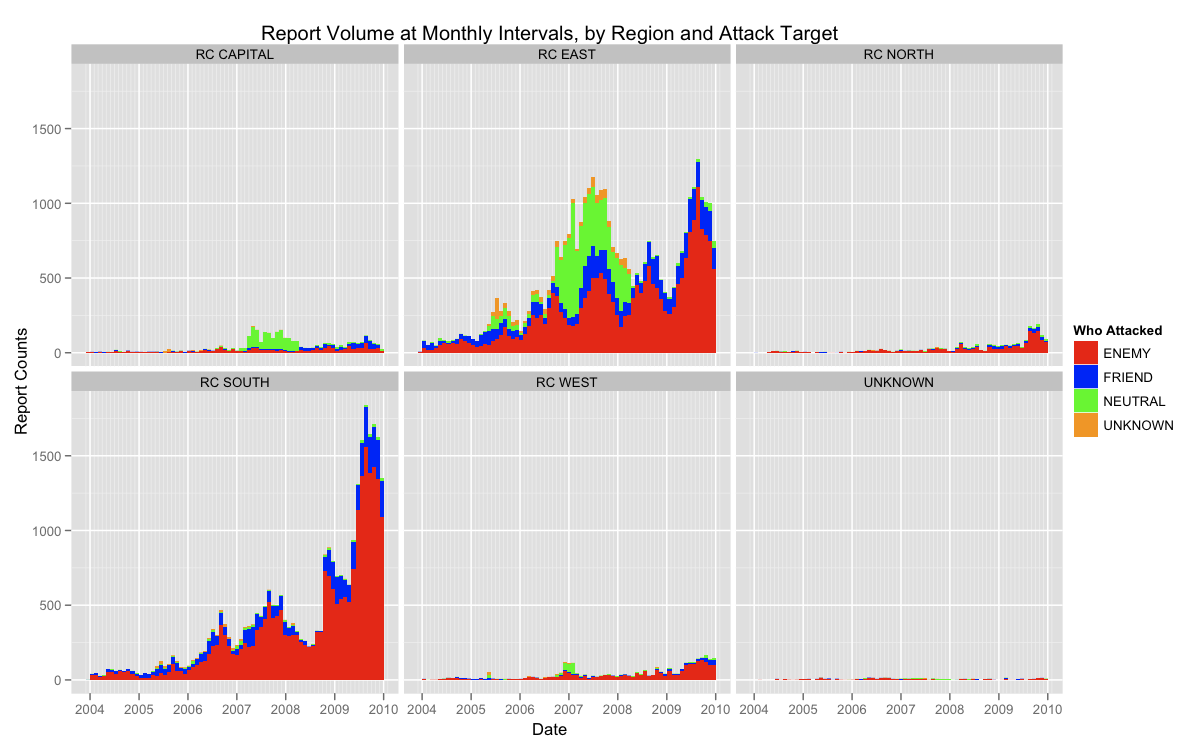
report_region.png

The above graph displays the volume of reports over the six year period covered by the data set, broken down by the reporting region, e.g, RC SOUTH, RC EAST, etc.; and the target of attack noted in the incident report, e.g., ENEMY, FRIENDLY, etc.

My motivation in creating this chart was to do a very quick assessment of the trends in the data. Given the nature of the reports, we would expect a noticeable degree of seasonality (peaks and valleys) given the natural ebb and flow of war. Any drastic deviations from this expectation could indicate a strong degree of selection on the part of Wikileaks. As you can see, however, the data generally do fit this expectation. Note the dramatic upward trending seasonality present in the heavy reporting areas of RC EAST and RC SOUTH. Perhaps more interestingly, though, is the sudden increase in the number of NEUTRAL reports present in the data for RC EAST and RC CAPITAL for the period roughly between mid-2006 and mid-2008.

Perhaps a more detailed reading of the reports from those areas at that time would reveal information about the nature of the fighting at that time, or the selection process present in the data.